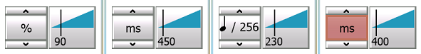
Table Slider
Slider: a component to pick a value between a min and a max, that accept keyboard and mouse wheel inputs.
Summary
| Field | Type | Summary |
|---|---|---|
| CurveColor | string | Color of the curve (triangle from min to max) in RRGGBB format. |
| DefaultValue | number | Default (factory) value. |
| IsVisibleMinMax | boolean | Are min and max visibles? |
| MaxValue | number | Maximum value |
| MinValue | number | Minimum value |
| Step | number | Step between two possible values |
| TextColor | string | Color of texts (min, max, value) in RRGGBB format. |
| Value | number | Value of the slider |
| Return type | Function and summary |
|---|---|
| OnChange(Dialog dlg, Slider slider, number value) Function fired when value is modified. |
Fields
number Slider.MinValue
Minimum value
number Slider.MaxValue
Maximum value
boolean Slider.IsVisibleMinMax
Are min and max visibles?
number Slider.Step
Step between two possible values
number Slider.DefaultValue
Default (factory) value.
A dual click on the slider reset value to this one.
number Slider.Value
Value of the slider
string Slider.CurveColor
Color of the curve (triangle from min to max) in RRGGBB format.
Default is "2299BB"